

Case Study:
Paw’s Organic CatFood Order Tracking App Design
Project Overview
The Problem
Customers are worried about knowing when their order will arrive. Since the cat food is organic and can be a refrigerated item it is important to know when the item will arrive.
The Product
Paw’s is a up and coming Organic Cat Food ordering and delivery app. They want to make sure their customers can track their order step by step and be able to set a delivery date.
My Role
Lead UX designer for Paw’s Mobile app from Conception to delivery.
Responsibilities
Conducting interviews, paper and digital wireframing, low and high-fidelity prototyping, conducting usability studies, accounting for accessibility, and iterating on designs.
Project Duration
February 2022 to May 2022
Understanding the user
I conducted interviews and created empathy maps to understand the users I’m designing for and their needs. A primary user group identified through research was busy adults who want to make sure they know when their fresh cat food will arrive and to avoid food spoiling.
This user group confirmed initial assumptions about Paw’s customers, but research also revealed that time was not the only factor limiting users from coordinating a delivery. Other user problems included obligations, interests, or challenges that make it difficult to be present when a delivery arrives at their household.
User Pain points
Time
Working adults can have a tight schedule limiting when they might be available to receive their order of fresh Cat Food.
2. Forgetting
With everything that an adult has to keep tracking of something they can forget to order additional food for their pet when they running low.
3. Accessibility
Text too small for older adults to read.
Persona & problem statement
Beth is a Busy Mother who needs to make sure she is stocked up on her beloved cats food because she doesn’t want to worry about having to run to the store with her toddler.
User Journey Map
Mapping Beth’s user journey revealed how helpful it would be for users to be able to schedule a delivery date.
Starting the design
Paper wireframes
I drafted iterations of each screen of the app on paper ensured that the elements that made it to digital wireframes would be well-suited to address user pain points. For the home screen, I prioritized a clear view of the customers order status and new product available to help users have a idea of when there order will arrive

Digital WireFrames
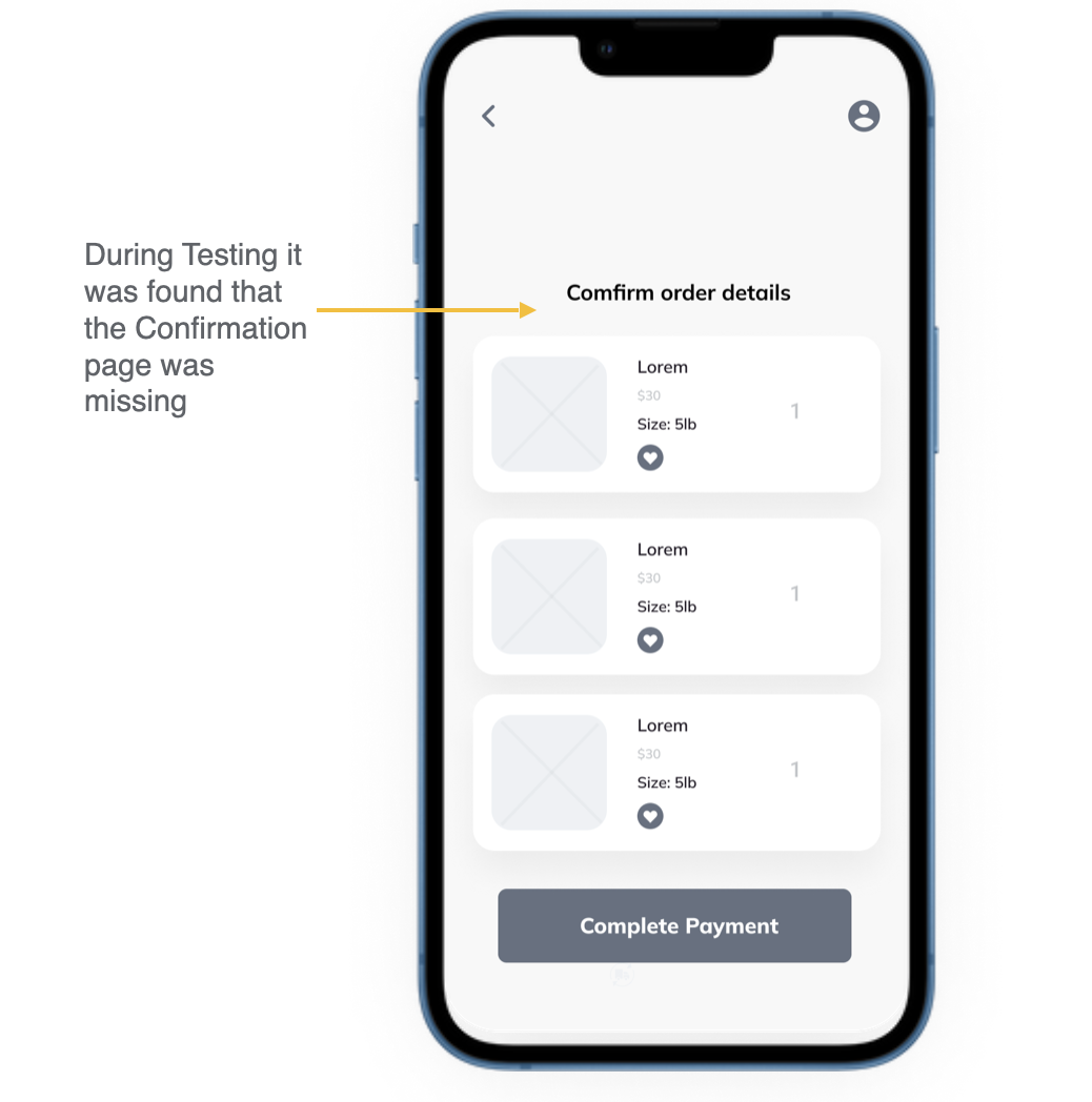
Missing confirmation page in initial testing. Made sure too added in as it is important for user to be able to confirm their orders before purchase.
Users had trouble finding where to click to check their order status. We added in a button to help.

Usability Study Findings
I conducted two rounds of usability studies. Findings from the first study helped guide the designs from wireframes to mockups. The second study used a high-fidelity prototype and revealed what aspects of the mockups needed refining.
Round 2 findings
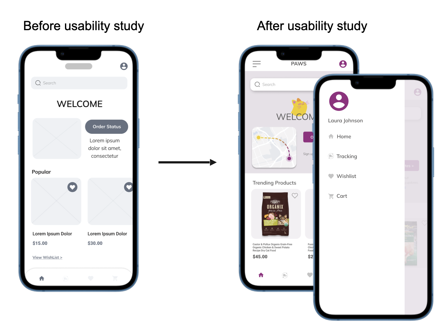
Users wanted to be able to find the order tracking feature easier.
Users wanted improved navigation to wishlist screen.
Users wanted to confirm there order before final payment
Round 2 findings
Users wanted a side menu.
Users where able to find order tracking much easier.
Users said it was hard to read some of the smaller text.
Refining the design
Mockups
Early designs allowed for some customization, but after the usability studies, I added additional options for users to be able to find the order tracking button easier and added a confirmation page. The second usability study revealed that users would like to have a side navigation menu. I also added an easy to recognize icon that indicates a side menu when they first land on the home screen.
Accessibility considerations
1. Contrast Check
Originally for the high fidelity mockups the app had a much more vibrant color palette but after contrast checking we discovered it was not compliant and updated.
2. Navigation
We made sure there is multiple ways for users to navigate though the app. Also icons icons to help make navigation easier.
Refining designs
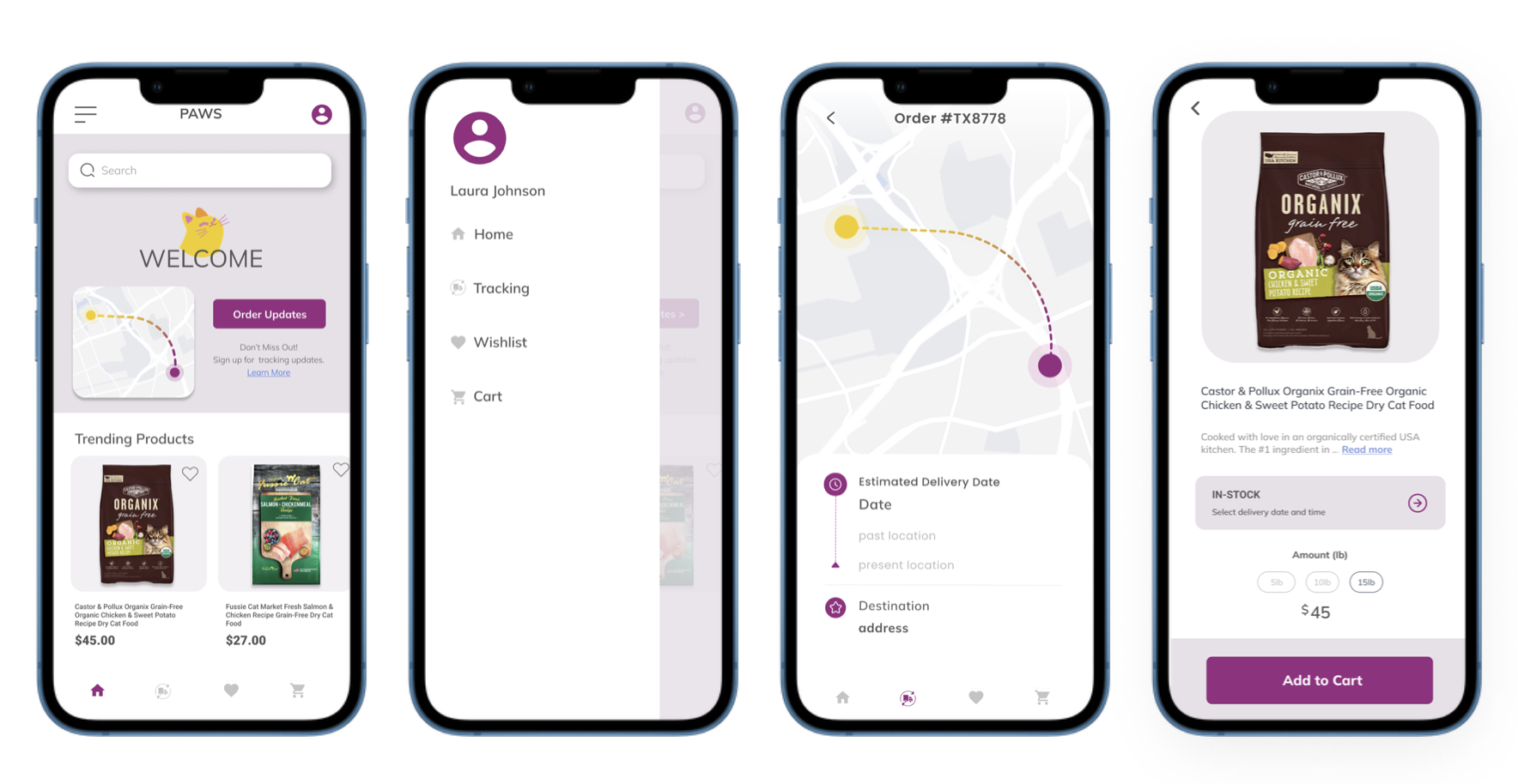
High- Fidelity Prototype
The final high-fidelity prototype presented cleaner user flows for order tracking and checkout.

Going Forward
Takeaways
Impact
The app help users track and schedule their orders, check out and also view and add products to their wishlist for later.
What I learned
While designing the Paw’s organic Cat food order tracking app, I learned that it's important to think about accessibility when design an app. It's important to design an app that everyone can use and benefit from.
Next Steps
1.Testing
Conduct another round of usability studies to validate whether the pain points users experienced have been effectively addressed.
2. User research
Conduct more user research to determine any new areas of need.