

Case Study:
Max Theater’s Website Design
Project Overview
The Problem
Showing up to a theater and all the seats being sold out can lead to a bad experience.
The Product
Max Theater’s is a local movie theater that shows all new and already released films. They are known from its small cozy venue and home made food delivered right to your seat. Max Theater’s goal is to create a site that allows users to book their seat a head of time to prevent any issues with tickets already being sold out on arrival.
My Role
Lead UX designer for Max theater’s website design from Conception to delivery.
Responsibilities
Conducting interviews, paper and digital wireframing, low and high-fidelity prototyping, conducting usability studies, accounting for accessibility, iterating on designs and responsive design.
Project Duration
May 1, 2022 to May 29, 2022
Understanding the user
I conducted interviews and created empathy maps to understand the users I’m designing for and their needs. I discovered that many target users love to go movies on the weekend but it can get very busy on holidays or summer months leading to tickets selling out fast. This caused the enjoyable experience to become upsetting as when some customers would arrive tickets would already be sold out.
User Pain points
Experience
Arriving to the theater and no seats available.
2. Times
Movies can be hours and know what times are available can help out with the planning process.
3. Accessibility
Being unable to know if handy cap sections are available until arriving.
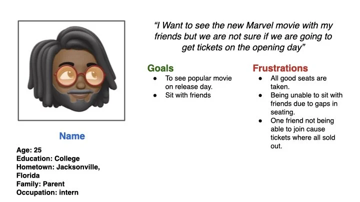
Persona & problem statement
John Is a college student who needs to preorder tickets to the new movie release for him and his friends because he wants to make sure they are able to buys tickets and sit together.
Starting the design
SiteMap
My goal here was to make strategic information architecture decisions that would improve overall website navigation. The structure I chose was designed to make things simple and easy.

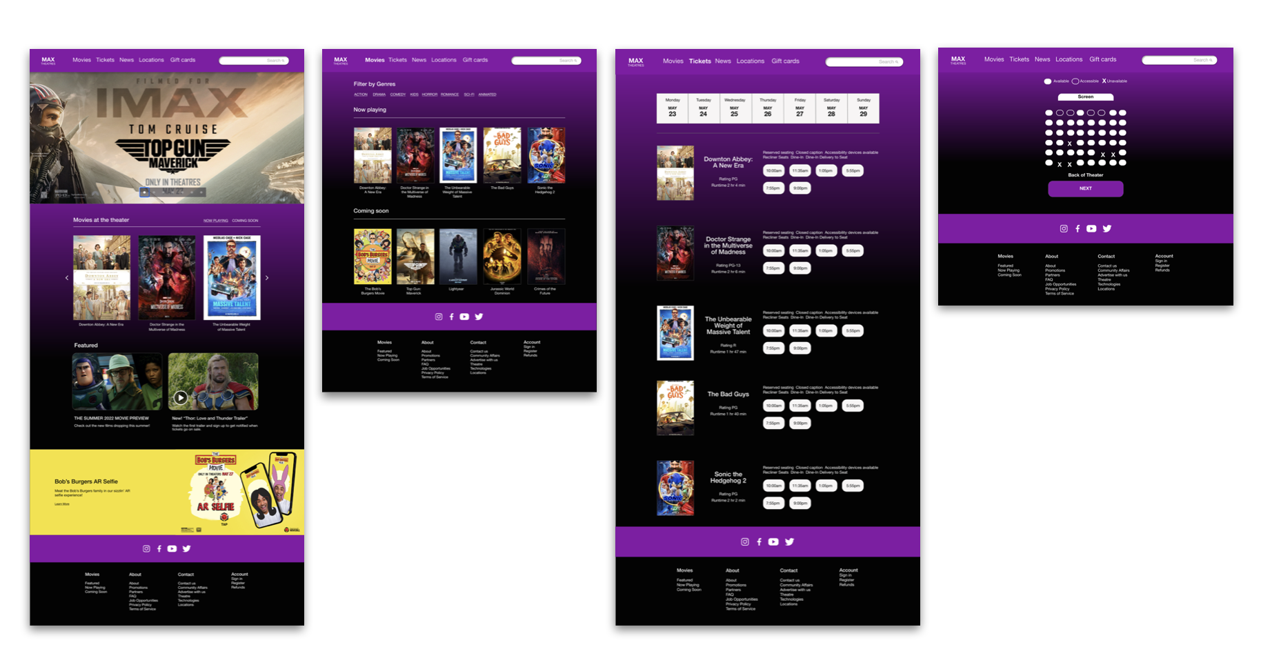
Digital WireFrames
Digital wireframes made it easy to understand how the seat reservation flow could work and help address user pain points and improve the user experience.

Usability Study Findings
To start testing the designs, I created a low-fidelity prototype which you can view here. This prototype was used in an unmoderated usability study with 5 participants. Here are the main findings uncovered by the usability study:
1. Info on Movie.
Users wanted to see basic facts about the movies like run time and rating.
2. Reserved seating
Users weren’t able to easily identify seats that where already taken during the reservation process.
Refining the design
Accessibility considerations
1. Contrast Check
Color Palette was test through the contrast checker to make sure it meets standards.
2. Screen Readers
I designed the site with alt text available on each page for smooth screen reader access
Refining designs
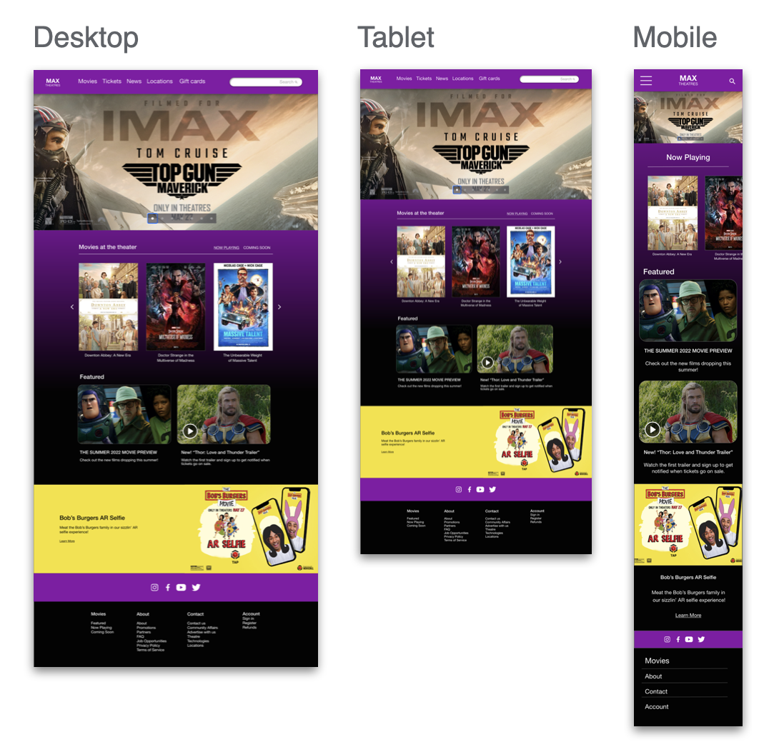
Screen size variations
I included considerations for additional screen sizes in my mockups based on my earlier wireframes. Because users purchase tickets from a variety of devices, I felt it was important to optimize the browsing experience for a range of device sizes, such as mobile and tablet so users have the smoothest experience possible.
High-Fidelity Prototype
The final high-fidelity prototype presented a clear user flow for seat reservation and ticket purchasing.

Going Forward
Takeaways
Impact
Our Target users shared that the design was easy to navigate, and the ticket and seat reservation process was very smooth.
What I learned
I learned that even a small design change can have a huge impact on the user experience. The most important takeaway for me is to always focus on the real needs of the user when coming up with design ideas and solutions.
Next Steps
1.Testing
Conduct another round of usability studies to validate whether the pain points users experienced have been effectively addressed.
2. User research
Conduct more user research to determine any new areas of need.